EXHIBITION'S SECTIONS
1. THE BEGINNING
He was inspired by the graffiti he saw in the subways that were hip, streetwise and spontaneous. He also admired the graffiti artists’ ‘tags.’ Haring’s discovery of the subway helped realize this consuming desire to connect with other people. He used white chalk to draw his babies, animals, televisions and people on the black paper-covering the ad-panels to express universal concepts such as birth, death, love and war. Operating behind the backs of station attendants and police officers, he worked with incredible speed. The risk of getting caught no doubt added to the thrill. He produced as many as forty in a single day. The subway drawing was the beginning of his eminence.
2. TRANSCEND
Haring often used fluorescent color paint that would glow under black light. Black light was frequently used as decorations for club interiors in the 80’s. When he had an exhibition at the Tony Shafrazi Gallery in 1984, he made an installation of his fluorescent works in the basement, with a dance performance and a DJ playing all night long. Haring was perhaps interested in the psychedelic effects his images could give.
3. STORYTELLING
Throughout of his life, Haring was tireless in his work with children of all ages and backgrounds. He published a number of children’s books, designed various children’s items for his Pop Shop and held workshops in many cities. Haring’s images are universal and idiosyncratic. He created many images that are relevant to everyone; explore the creative possibilities of using language to interpret art.
4. HARING IN PISA
Keith Haring's adventure in Pisa was born from a fortuitous meeting, between the artist and the young student Piergiorgio Castellani, which took place in New York in 1987.
Castellani, with great foresight, proposed to Haring to create something great in Italy and the artist, in a way that was not at all obvious, accepted the challenge. Thus was born the Keith Haring Italian Project.
It was a choral work: Castellani brought Haring to Pisa, the Church made the wall of the Convent of Sant'Antonio available as a surface to paint, the Municipality and the Provincia coordinated the project, the university participated with several students who helped the artist as assistants.
On June 20, 1989, Tuttomondo was inaugurated, the monumental mural painting which, with an area of 180 square meters, testifies to the world Keith Haring's passion for life: a hymn to joy that is still considered his artistic testament today.
5. SYMBOLS AND ICONS
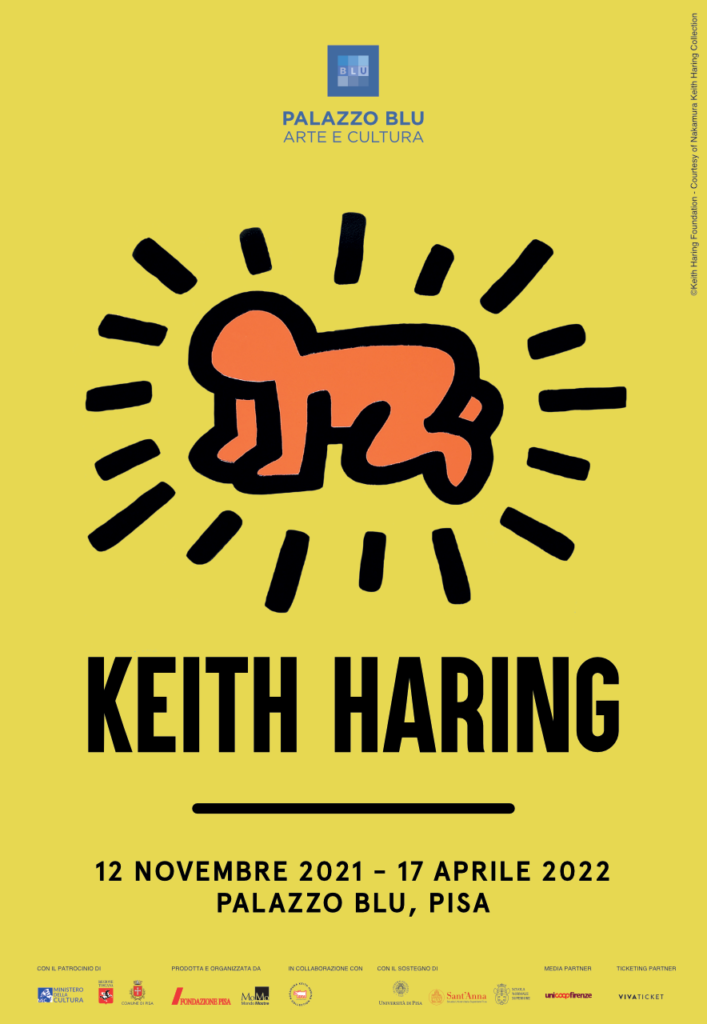
The symbols he created are like a predecessor to today’s Emojis : smiley faces as well as hearts, the radiant baby, the angel, the barking dog, the dolphin and other of his ideograms. They touched on topics that are relevant to youth, in the 80’s and even today’s SNS generation, love, life, death, pop culture and politics
6. MESSAGGE AND MUSIC
AIDS prevention, gay rights, apartheid, racism, drug use, wars, violence and environmental protection were the issues that Haring cared about the most and he used posters to bring them to public attention.
In addition, he lent his trademark images with vivid color to advertise numerous concerts, music events and his own exhibitions. There are intransigent messages behind the vivid and happy images.
Haring collaborated with many musicians to create eye-catching, controversial, even iconic imagery to accompany their tunes. One of his significant covers is for David Bowie’s 1983 album. Featuring two figures locked in a radiant embrace, the simple image reflects the song’s message of love and connection. Music was very important for his life and his art. He was one of the rare artists who visualized sound and messages through his art.
7. PRIMEVAL ENERGY
Pyramids filled with countless figures, animals, suns and masks… the body paintings and the Totem. Keith Haring’s oeuvre, set against the background of the artist’s statements, is the space between vernacular art and scholarly art, between creation and appropriation. In his works, there are mysterious powers hidden by non-Western art like the Aztecs, the Eskimo, African and Afro-American art or mythic ancient symbols.
8. UNCOVERING THE DISTOPIA
In Haring’s collaboration with beat writer William Burroughs, he pursues sinister themes in surreal landscapes. His provocative imagery transcends mere political comments- with visions of despair but we also feel Haring’s humor and satire. Apocalypse was created after he was diagnosed with HIV. We are given a glimpse of his Hell.
9. THE END OF THE BEGINNING
The imagery features the inchoate elements of the iconic language associated with Haring to this day – pyramids, flying saucers, dogs, snakes and crawling babies are intermixed with wandering figures and humans, animals and extraterrestrial activities. In the 1990s, one month before his death, he published his final edition on paper, a portfolio of 17 silk screens that duplicates a group of his earliest and purest visual narratives. He combined symbols and scenes into the comic strips to depict dark sides of our society.

Per tutte le immagini presenti
Courtesy of Nakamura Keith Haring Collection © Keith Haring Foundation


